Lizard Joe is a manuscript exchange platform for writers to help them connect, and generate large quantity feedback on their work before working with editors, publishing or pitching to a literary agent.
The platform’s design: main objective:
Creating a comprehensive and focused online digital exchange to bring together readers and writers • Standardise, streamline and simplify the feedback process • Provide publishers and literary agents with a means to discover new trends and currently unavailable insights using data analytics • Provide professional and amateur readers with the means to engage with one another and enable them to turn their hobby into income.
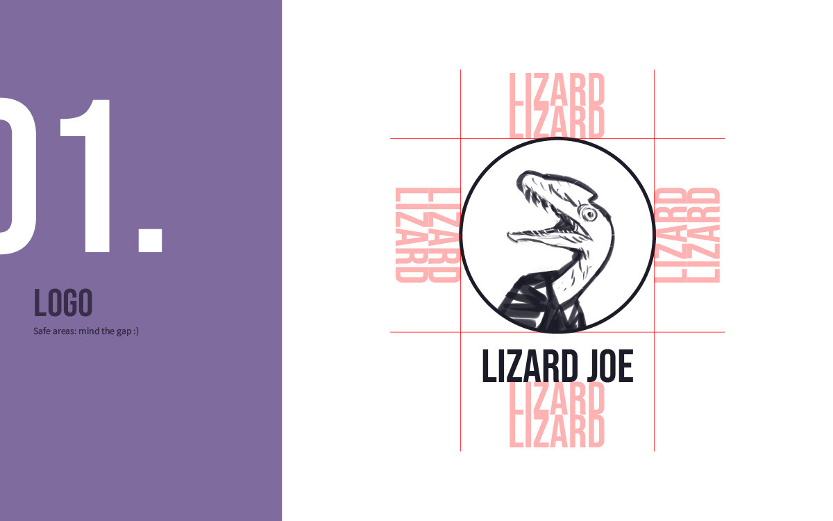
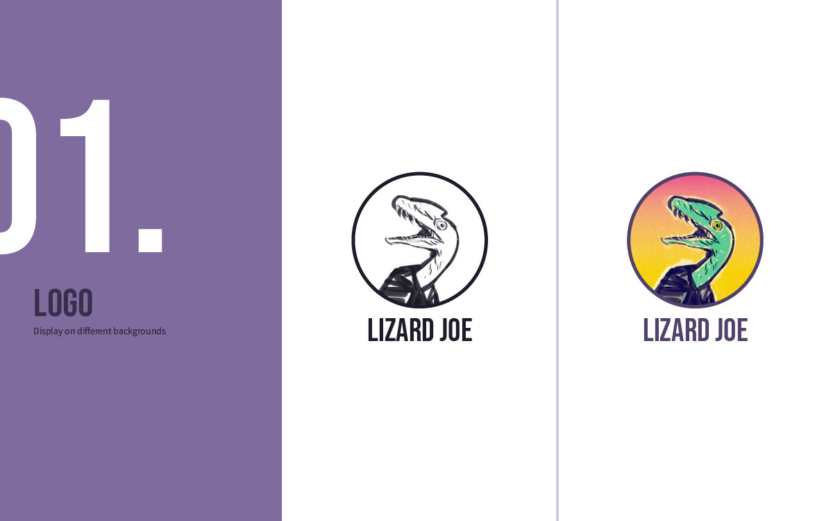
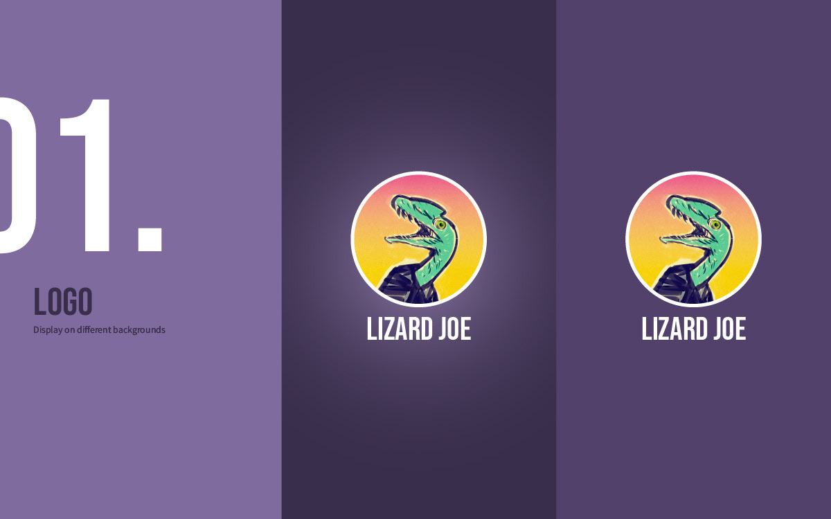
Branding guide excerpts: the logo
The Lizard Joe logo was created by hand to feel approachable, human, and relatable. The organic lines give the brand a sense of authenticity and personality, helping users feel a genuine connection rather than the distance often associated with highly polished tech brands. The handmade aesthetic reflects the platform’s focus on creativity, accessibility, and real human interaction.
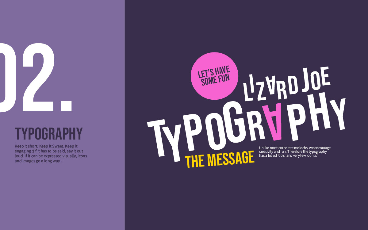
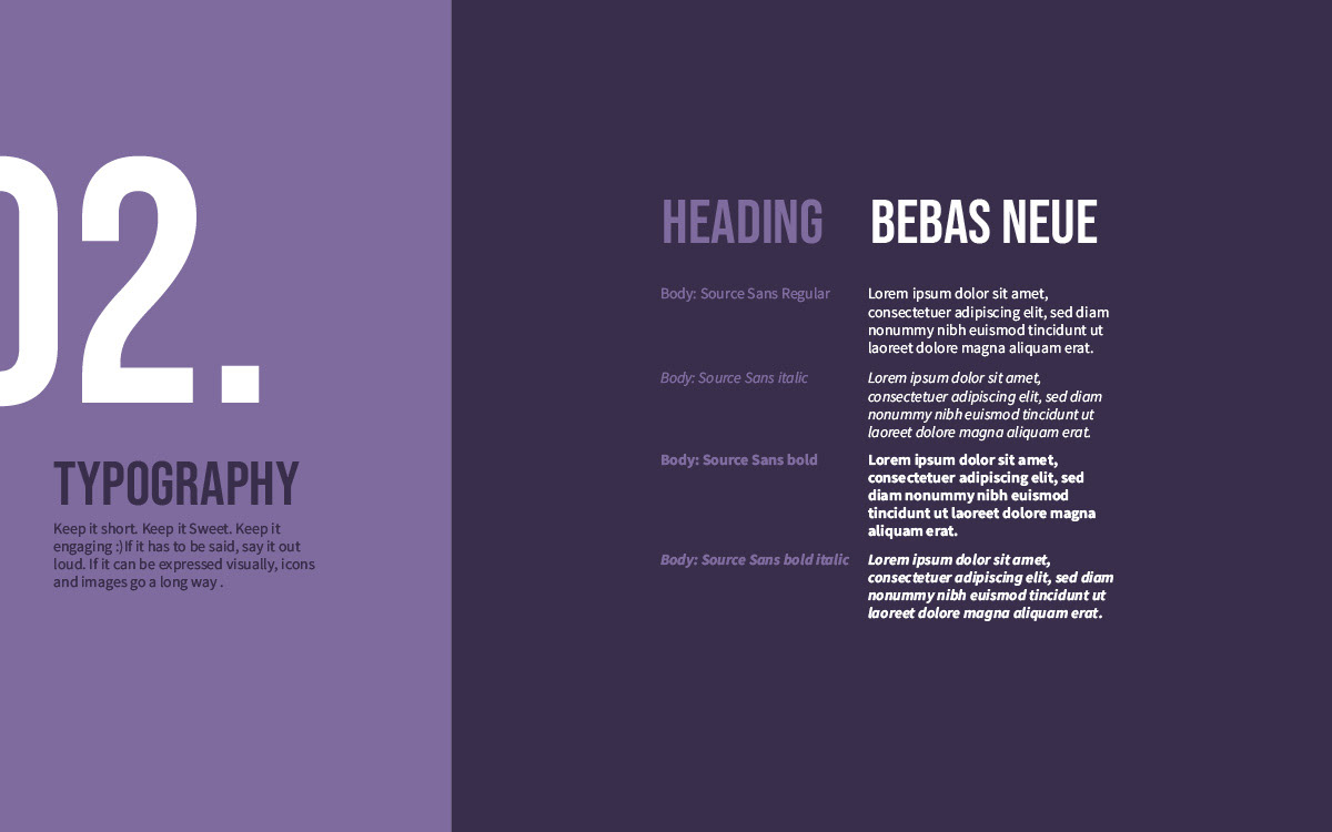
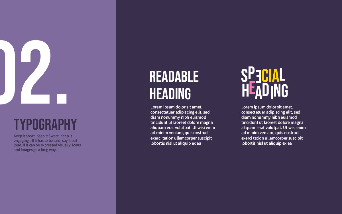
Branding guide excerpts: Typography
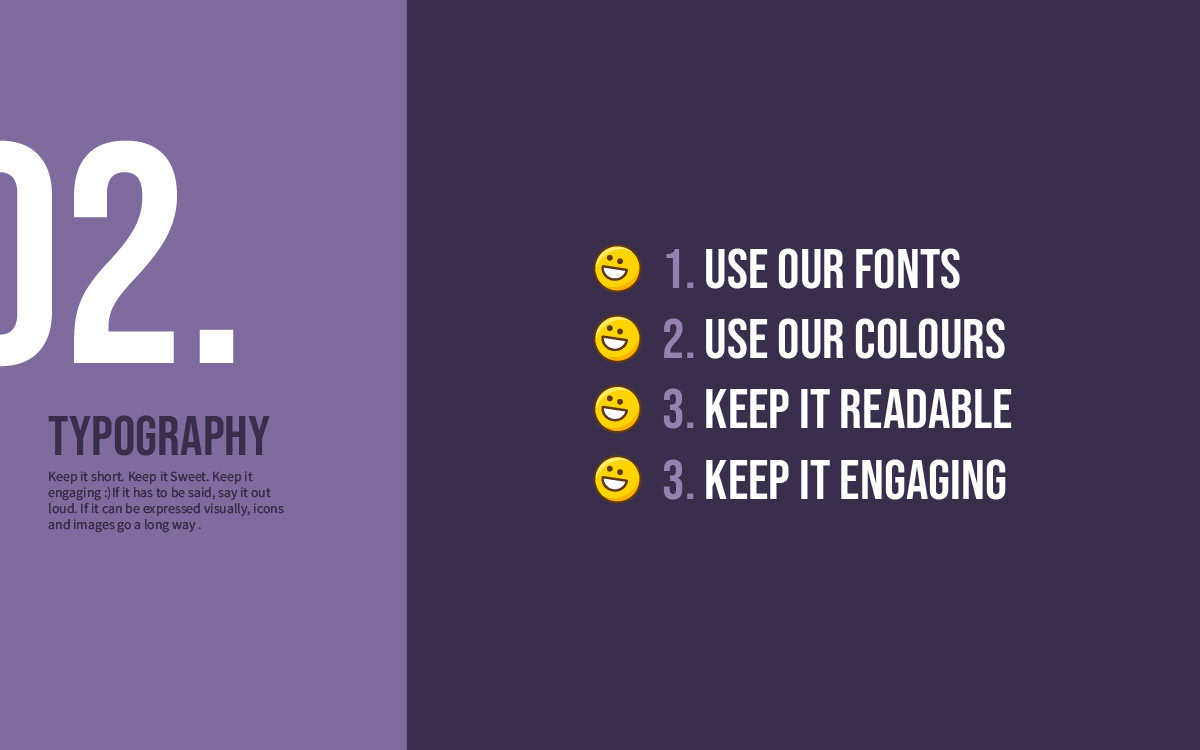
The typography balances clarity with character. It remains highly readable across the platform while incorporating playful details that reinforce the brand’s creative and friendly personality. This combination ensures the design feels intuitive and accessible without sacrificing visual charm or individuality.
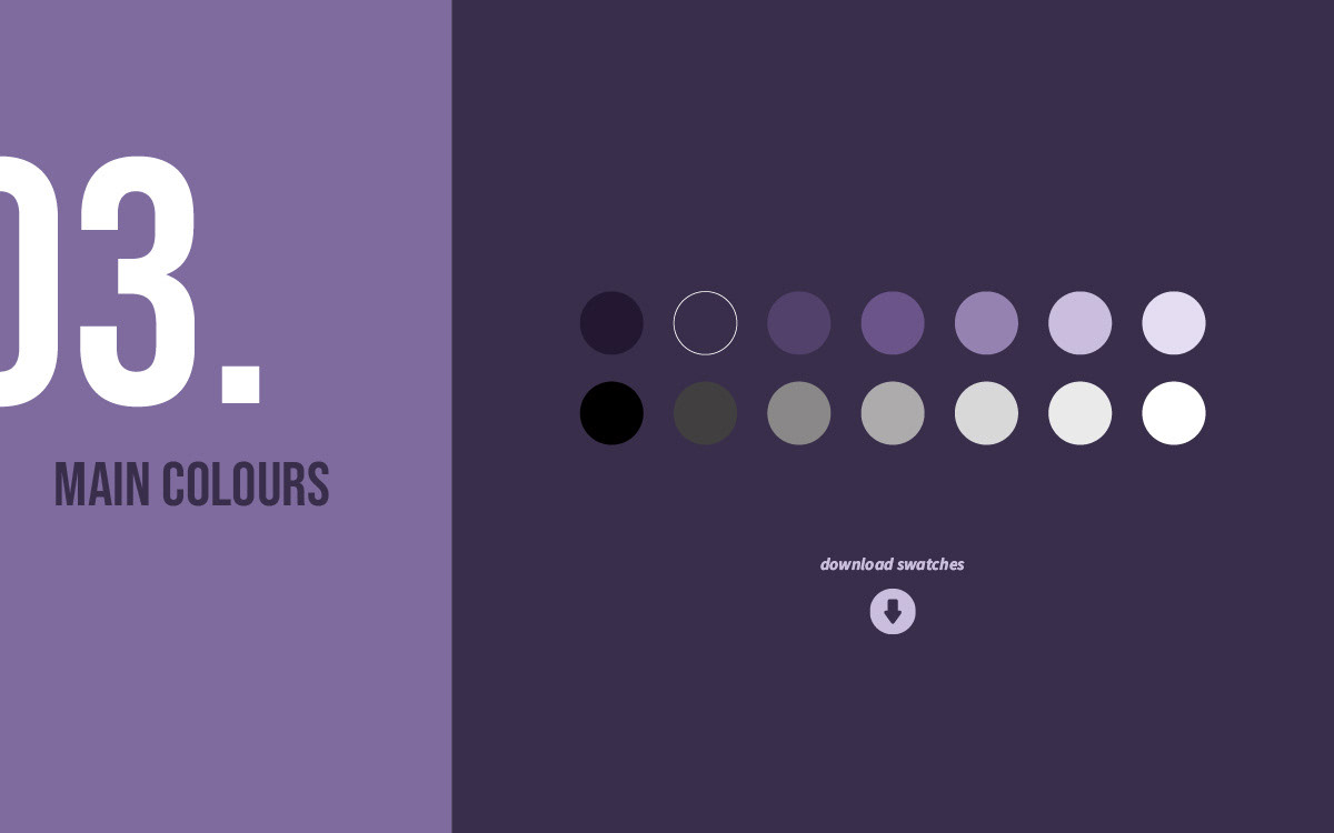
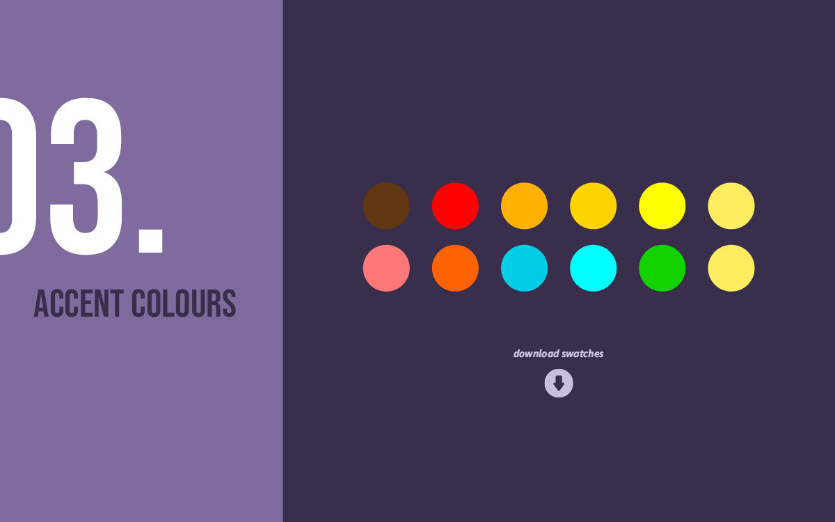
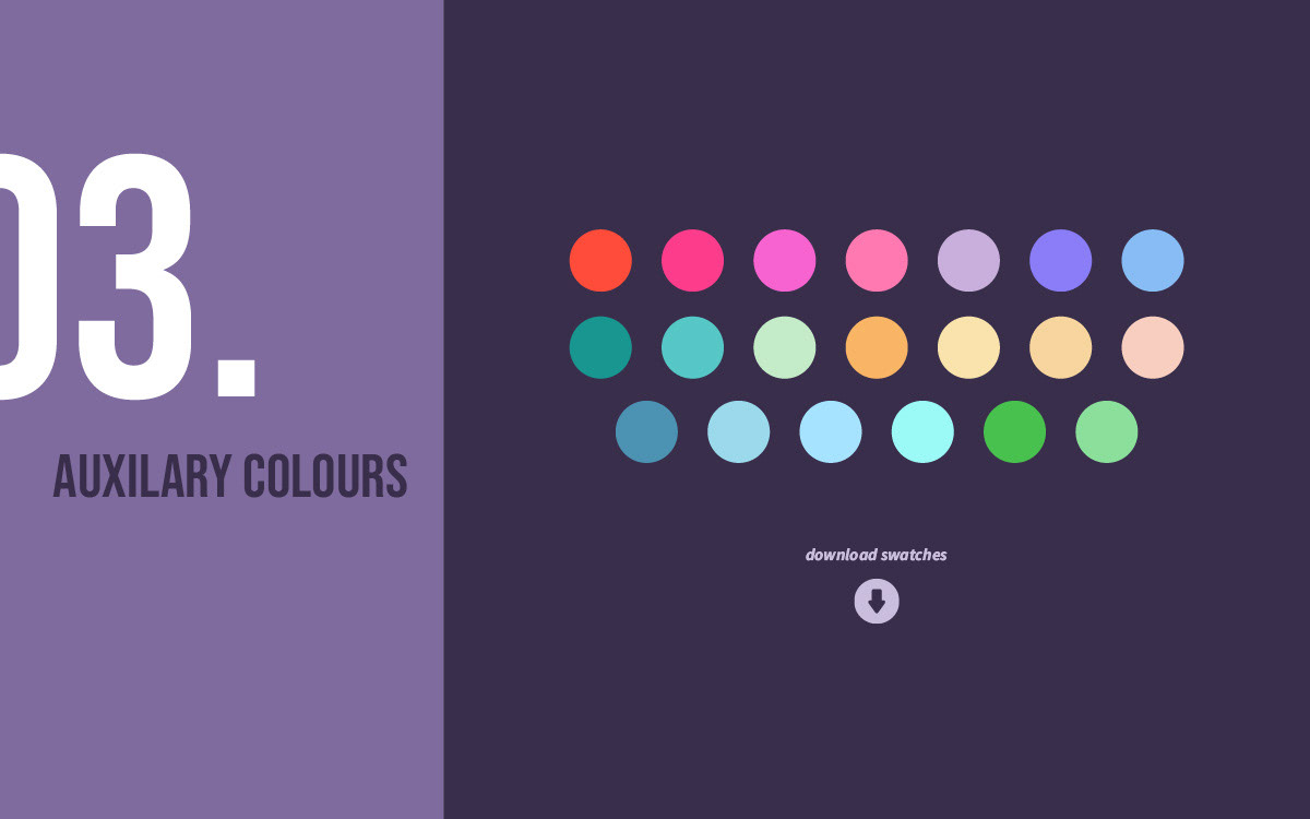
Branding guide excerpts: Colour Scheme
Purple was chosen as the core brand colour to evoke a sense of mystery and imagination, but without becoming visually heavy or overly corporate. Supporting colours introduce balance and levity, creating a vibrant and welcoming identity that feels playful, fresh, and easy to engage with. Together, the palette allows the brand to feel distinctive while remaining warm and approachable.
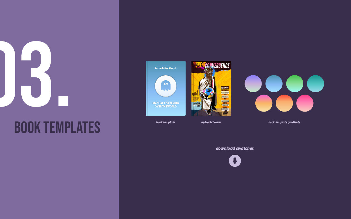
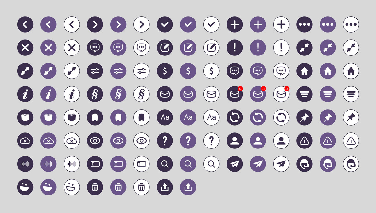
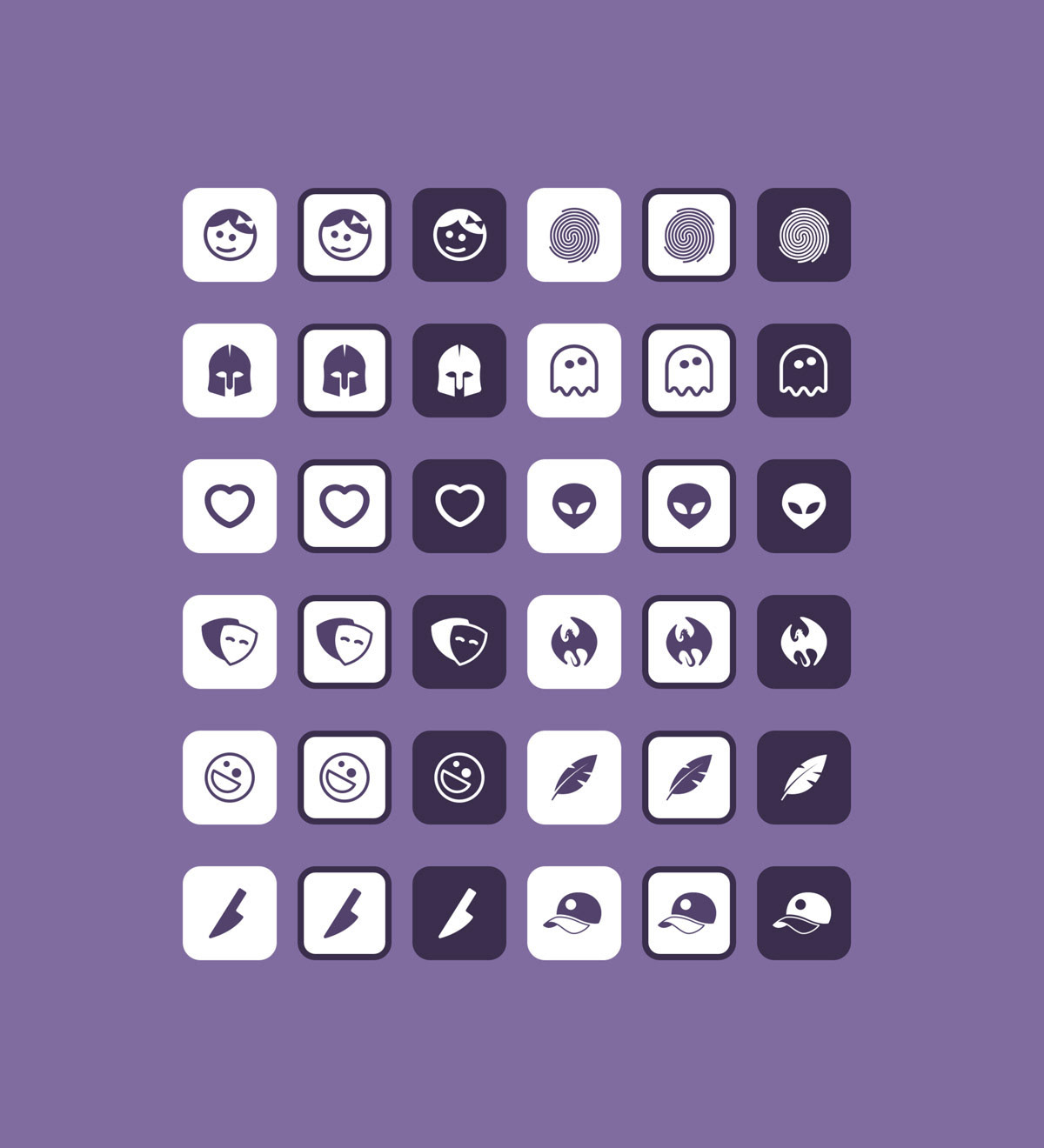
Icon design and specific UI elements:
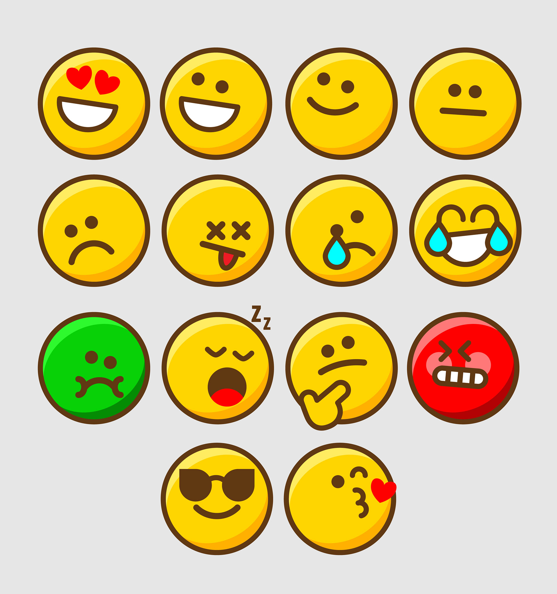
The project included designing user interface elements (book templates, smileys and more) and complete icon sets. The icons and UI follow the same philosophy as the wider brand identity — handcrafted, playful, and expressive while remaining intuitive and functional. Rounded shapes, subtle imperfections, and cohesive visual cues help create an interface that feels friendly, memorable, and easy to navigate.
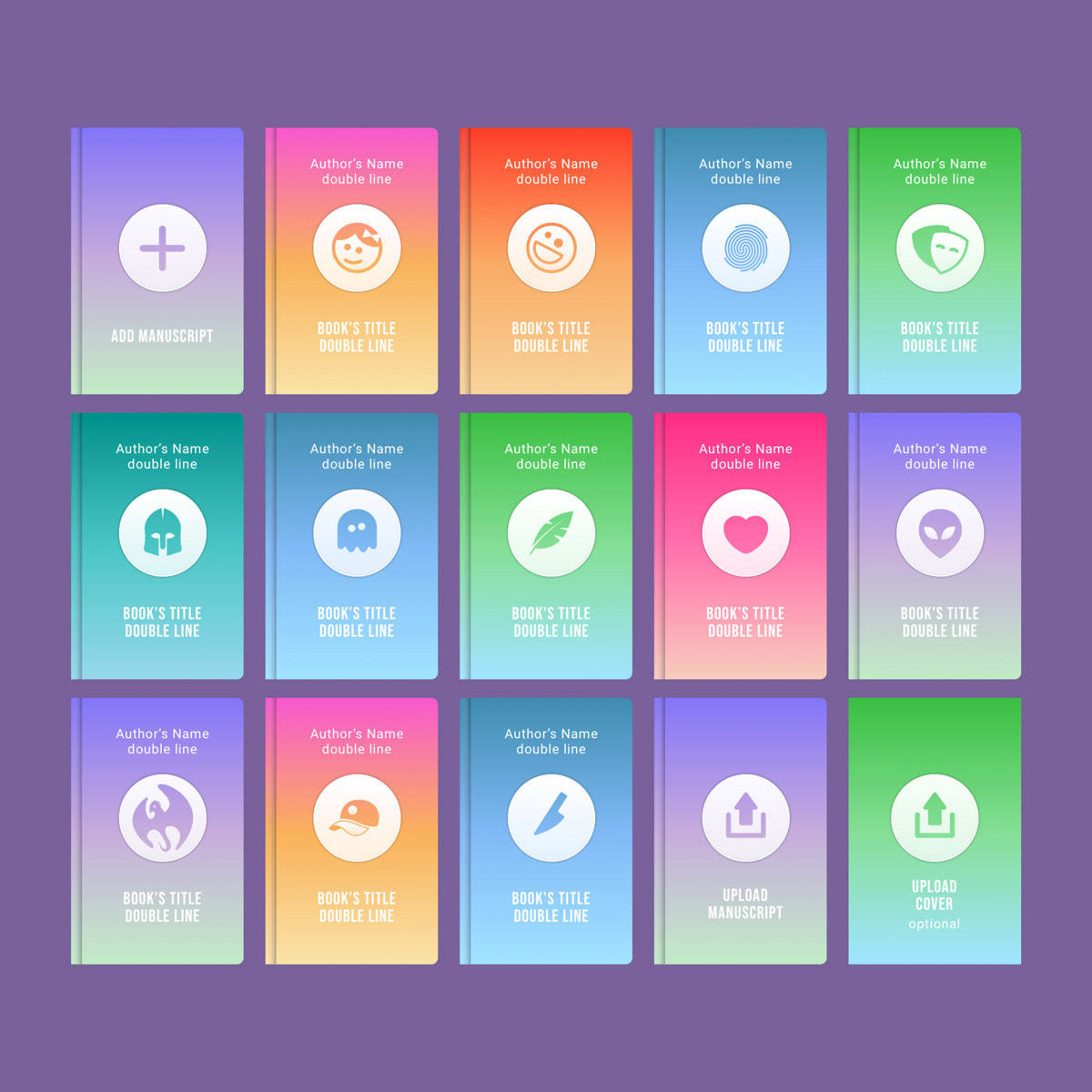
templates for various book genres
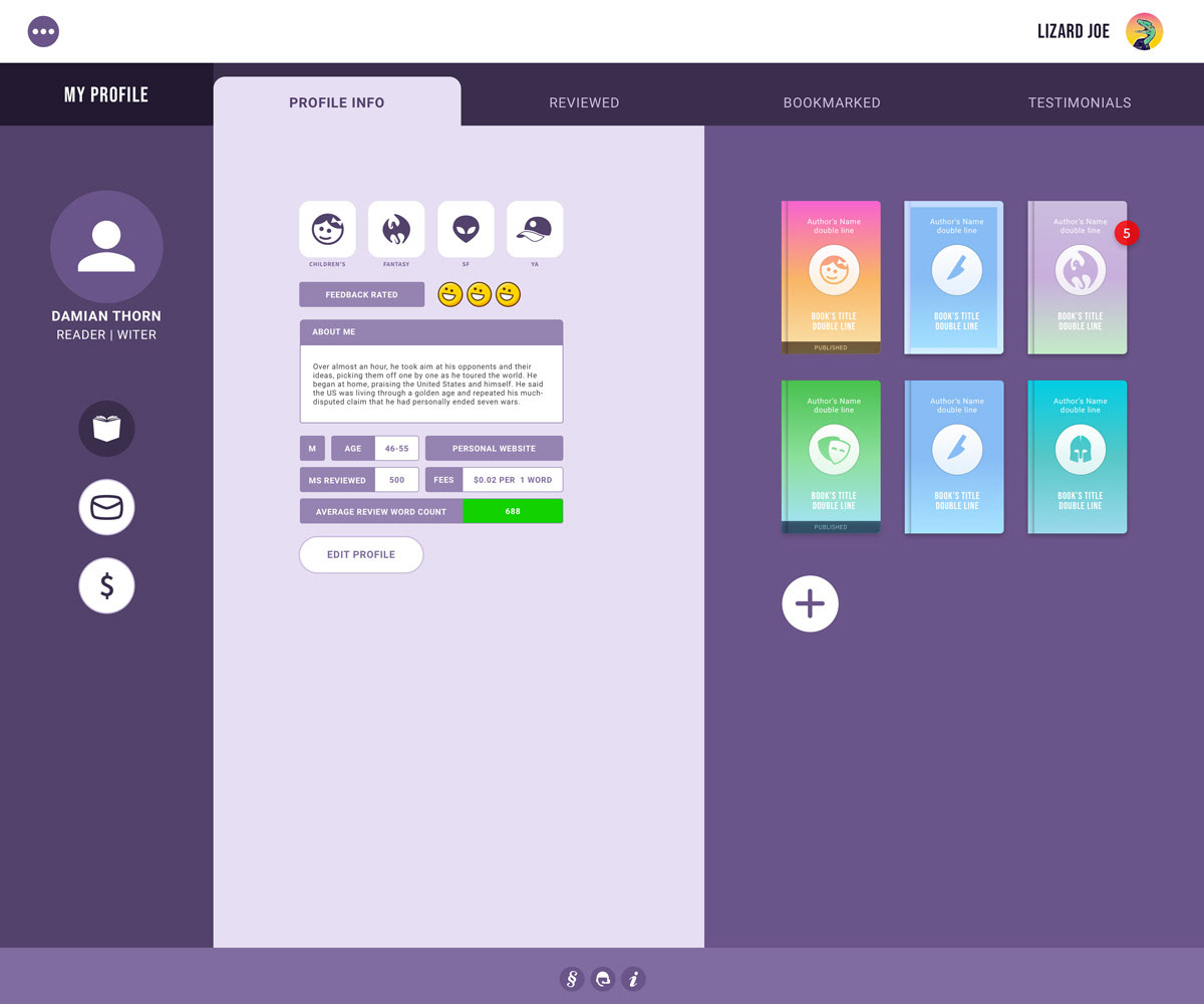
A practical example (user profile panel + book review tab)
Custom made interactive icon set
Bespoke icon set for book genres
Smiley icons to be used in manuscript assessment